Mastering Xperience by Kentico: Must-Know Tips for Building Websites with Page Builder
Lukasz Skowroński - Senior Solutions Architect
8 Jan 2025
A few years back, the market convinced all the customers and developer teams that headless is the future. Since then, messages sent to the market have changed, and now you see more often recommendations to use a hybrid approach that meets not only modern architecture designs but also business needs.
Business users usually expect to be able to manage the visual content they add and design pages without any further involvement from the IT department.
Xperience by Kentico provides options for headless development (designed to provide data for external microsites or other apps that consume data through APIs) and well-known coupled DXP with coupled architecture based on .Net and MVC architecture.
Page Builder, built into XbK, allows you to build pages from the components prepared by your dev team, which meets the business owners' expectations. However, providing that feature to non-technical users requires more attention in a few areas of website creation. We will try to cover these in this article.
Xperience by Kentico modes
When you access visual editors at XbK you will notice a few different modes available.
We can distinguish the following modes:
- Normal Mode / Read-only Mode (!(HttpContext.Kentico().PageBuilder().EditMode.Enabled && HttpContext.Kentico().Preview().Enabled))
- Edit Mode (HttpContext.Kentico().PageBuilder().EditMode.Enabled)
- Preview Mode (HttpContext.Kentico().Preview().Enabled)
For people who work with real DXP for the first time, modes may seem unnecessary, adding complexity to the system, but others with more experience consider them a must-have.
In a normal mode you can see your page divided into the components that you used to built the page
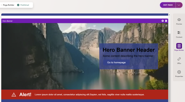
But you cannot edit any values.
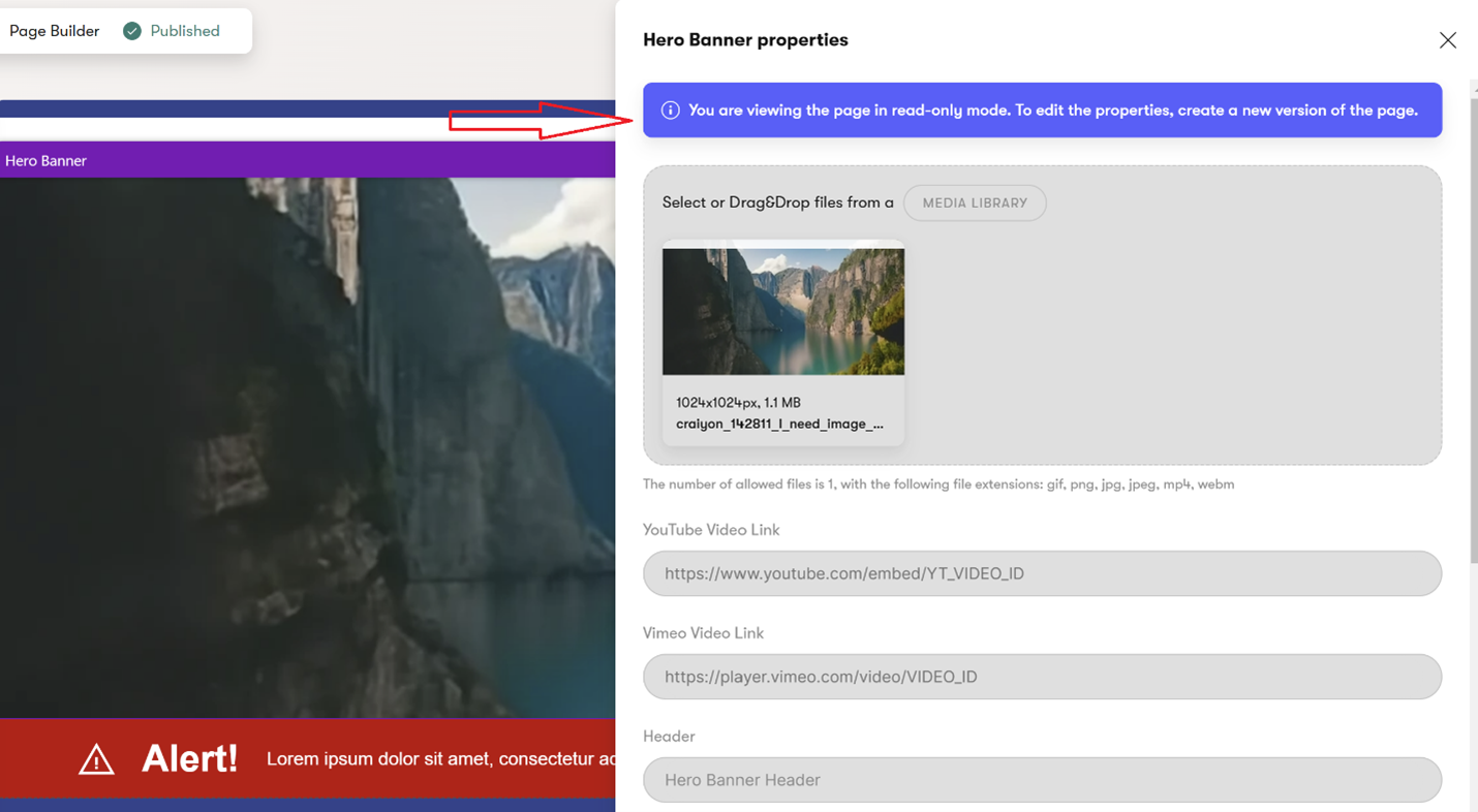
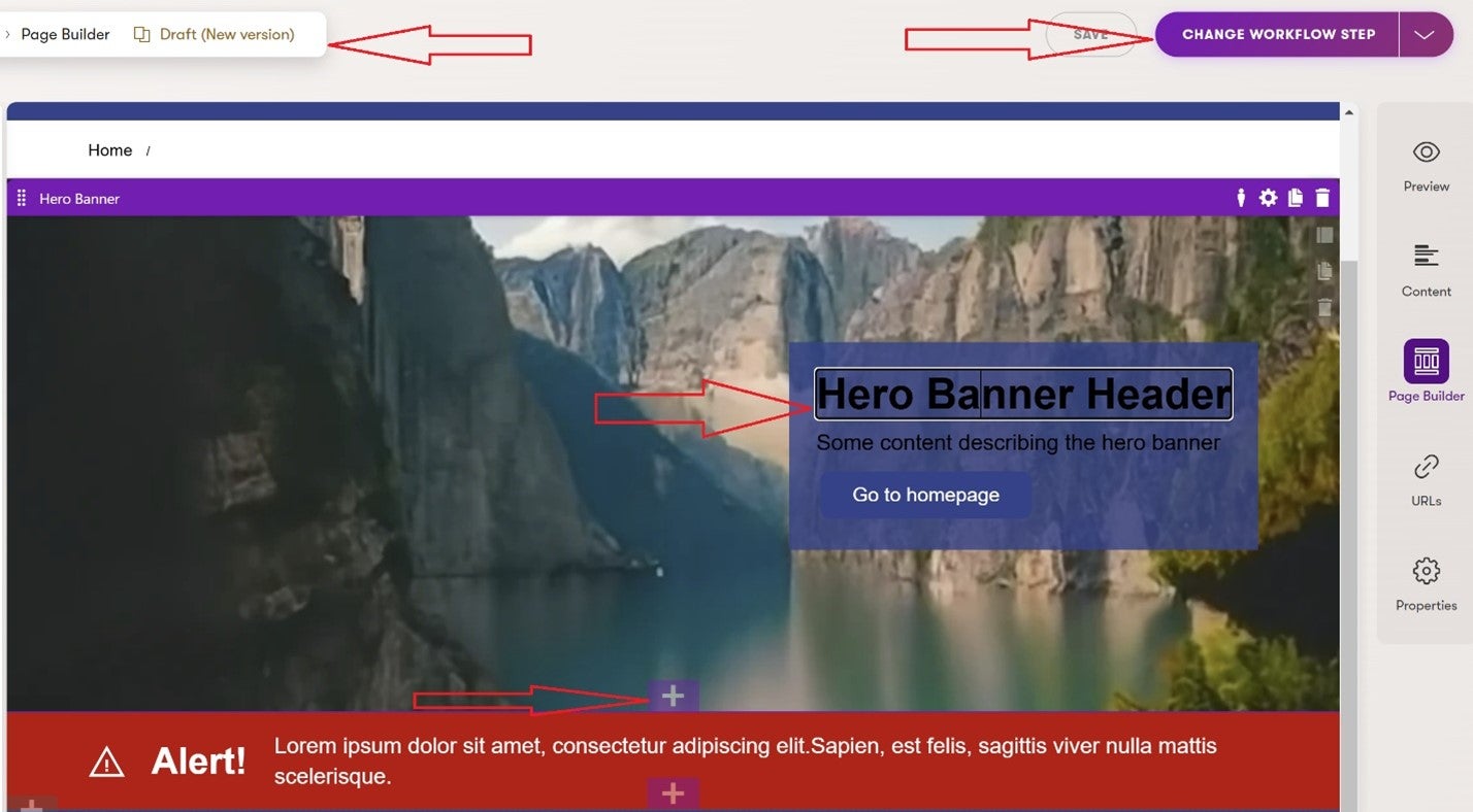
If you click “Edit Page” button in the top right corner you will switch normal mode into edit mode (in fact it does much more) where you can edit your page
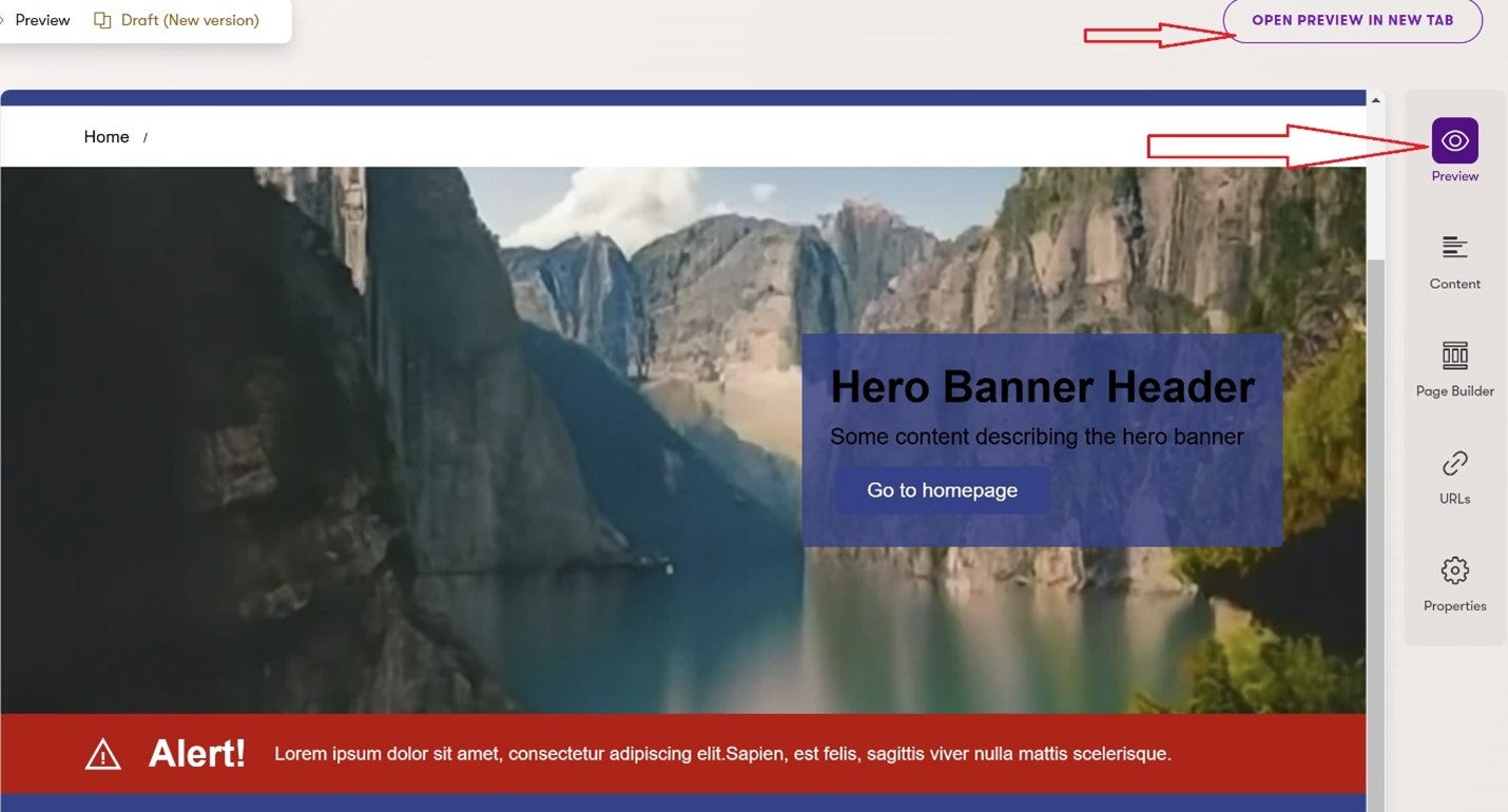
There is also a preview mode (on the right side pane) that allows you to see the page without adding additional controls.
Usage of the available modes
Normal, a.k.a. read-only mode, is the most obvious one. It is used to quickly review what components are added to the page, the settings, and where the content is coming from—it does not require more attention.
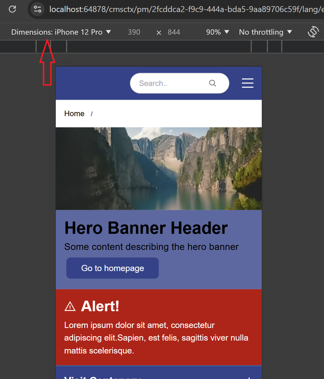
A more interesting mode is preview mode, which allows you to check how the page will look and behave with your content. The second part of the sentence is a key here – with a Preview mode, you can check if all styles are applied if UI/UX built with your frontend JavaScript libraries work correctly, and what is even more important if your page behaves at it was designed on different devices:
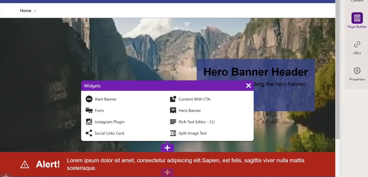
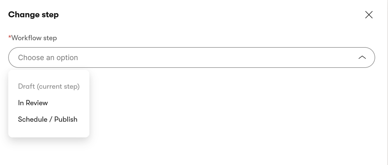
In the end, let’s focus on Edit mode, which allows you to design your page from the available components and manage available settings and content. When you start working on the changes and have workflows set up in place, Edit mode will also let you change a workflow state and publish the final state.
What to remember
Now that you fully understand the available modes, we will focus on the topics often forgotten in the projects' initial phase.
Visual page editing allows you to play with a page structure without the involvement of the dev team. Edit options are usually fairly simple:
- Inline editing (where you edit component content from the edit mode directly)
- Form editing (where you edit component content via form opened in separate overlay)
- Data source editing (where you can select existing data, often multiple data items)
The challenge usually starts when you use more complex components that load data from multiple sources. A good example of a component like that can be a carousel component.
When in a simple component you work almost like with a WYSIWYG, in a carousel you may want to select multiple data sources – the question is, how to make it visually editable for content editors?
The more tiles your carousel has, the bigger challenge you have – we do not want to force editors to scroll through the carousel to find the one they want to update. We also do not want to limit their editing capabilities by carousel speed. How to deal with it then?
With XbK, you have two options: Do not allow editing interactive complex components via page builder and limit available options to selecting data sources—content changes have to be made in Content Hub, where the data sources are stored. The other option is to create a separate simplified view for Editor mode.
We added two carousel items displayed in a stack like this example.
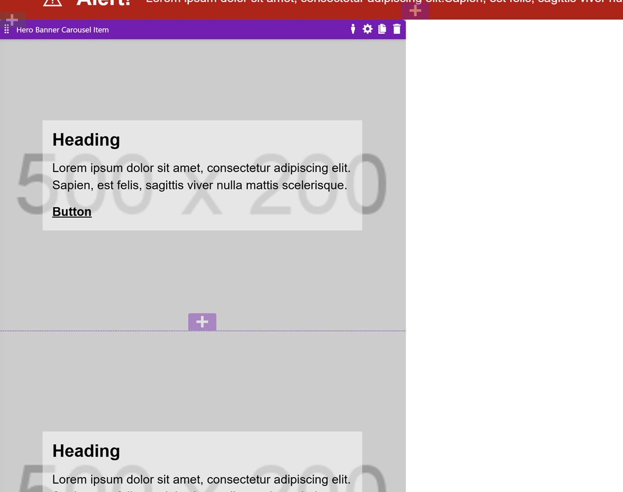
When in the preview mode we display these items as proper carousel
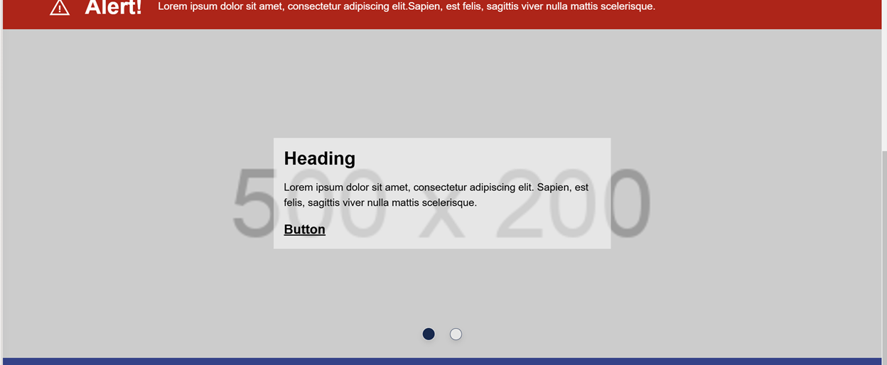
It looks and works cool, right? Content editors have easy and quick access to the items, and they can review how everything behaves after the changes are applied.
To make it work like that we have to remember a few things.
Components utilizing such complex structures require very often separated coding on the view and styles level – a simplified example may look like this one:

Changed views and styles also require more time reserved for coding and testing from now on. You have to test not only how the page behaves for visitors but also for editors, and frankly speaking, you should have done that before, but now you have one more scenario to verify.
More coding and testing means you need more time to build a solution like this one.
And since we are just one step ahead of the money topic, yes, at the end of the day, it will cost a bit more, so if you estimate components that are visually editable and more complex, you should also think about the UX of content editors.
Who would expect that there are so many considerations involved in the creation and visual editing of simple components on your pages? At first glance, you may ask yourself if that additional piece of work is in the category of pros or cons, as previously, you did not have to bother yourself or your customers with challenges like the one from this article. In my opinion, we start to consider these topics when we are mature enough and use tools designed for more sophisticated customers who know what they want. It all starts here with additional variants for components and ends in the future when you start adding personalization on top of what you learned from this article, and then the changed approach will make even more sense to you and your customers.

Lukasz Skowroński
For over 18 years, I have developed numerous solutions for customers worldwide. I specialize in DXP platforms, including Sitecore, Xperience by Kentico, and various CMSs such as Umbraco. So far, I have been awarded nine times with the Sitecore MVP title, once with the Kentico MVP. I continuously support various communities by organizing local user groups and larger conferences like Sitecore User Group Conference Europe (SUGCON Europe), as well as by sharing knowledge through blog posts.



Share on social media