Mobile app Design and Development Phase Deliverables - Part 1
Mostafa Hanafi - Program Manager
9 Nov 2020
In this post, I will provide an overview of a recent project at Konabos to show a practical example of how to use the outcome of a discovery phase for designing and building a mobile app (a sports app for archery students in the United States).
In a previous blog post, I highlighted key aspects of discovery and how to utilize them to build successful software products.
Our discovery phase adopted a Lean Startup methodology, where the focus was to build the right thing for the right people while saving resources at every step of the development life cycle.
(The Lean Startup by Eric Ries is a must-read to know more about this).
A major purpose of the discovery phase was to establish the WHY, which the main reason for building this product. Through the stakeholders’ interviews, surveys, and brainstorming sessions, we arrived at the WHY (our North star): Improve the performance of archery students in the US.
Afterward, through more digging into the stakeholders’ pains and gains, we arrived at our user’s needs. Here is an example of a user need (also called problem statement):
During self-practice, Students need to record their scores and share them with coaches and spectators for feedback on their progress.
Each problem statement was thoroughly analyzed, and various solutions were proposed, then refined to arrive at the best possible solution.
In turn, those solutions formed a list of benefits that became the basis of our product roadmap. The list was then prioritized on a value vs effort basis, then the MVP features were confirmed and ready to go into design and development.
The UX and UI design journey for this app has been very interesting, and here are a few key considerations that our team went through:
- The app must be very easy to use. It is intended to be used by kids as young as 9 years old, therefore the ease of use is top on our list.
- The app must be visually appealing. We had to strike a balance between gamifying the experience and making the app presentable for a professional sport. Also due to the wide age group, the app's UI could not be
- With slight changes in the UX, the app would be used by both kids (archers) and adults (coaches and spectators), therefore it was crucial for the app's UI/UX to be balanced (not too childish and not too serious)
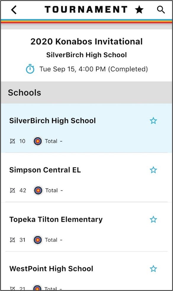
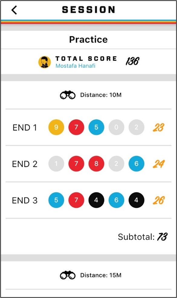
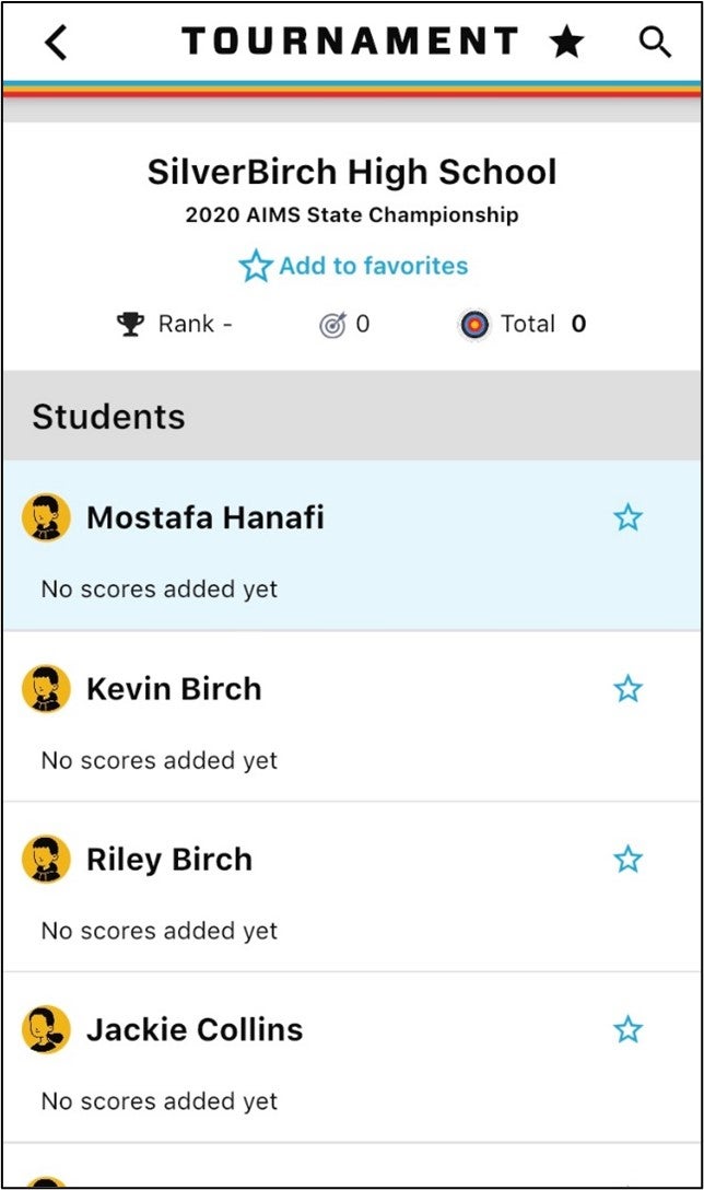
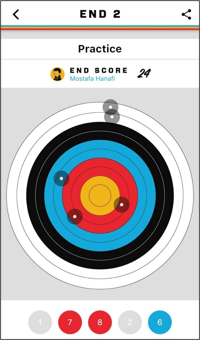
Here are some screenshots for the final UI:
Schools listing in a tournament
Scoring an archery session
Students listing in a tournament
Visualization of shots at target
The app is currently in development and in the subsequent blogs I will share more insights and learnings after the app’s launch.
Twitter @hanafimm LinkedIn hanafim.
Follow us on Twitter Follow us on LinkedIn Follow us on YouTube

Mostafa Hanafi
Mostafa is an experienced Project Manager and Scrum Master who has been managing Sitecore projects for more than 8 years. During his 12 years of experience in the field, Mostafa has also excelled as a Business Analyst and Product Manager, where he practices his passion for solving problems. In addition, Mostafa is also a two-time Sitecore MVP. As a Program Manager at Konabos, Mostafa will work with clients to ensure their business goals are achieved in the most efficient and cost-effective way.


Share on social media